Monthly Studio Review #1
What’s this? See programming note below.
1. Excursion: Boyce Mayview Park
One thing that continuously surprises me about the Pittsburgh area is how HUGE the parks are. The first park I went to had a wildlife preserve, including peacocks and bison. Bison! I knew I’d moved west, but that was (delightfully) ridiculous.
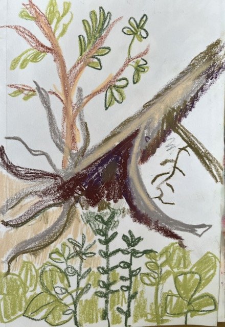
Anyway, Boyce Mayview Park, in Upper St. Clair, does not have bison as far as I know, but it is also enormous— just under 500 acres. So when I saw it on the map and decided to just pop by on my way from running an errand, I was not at all prepared for, like, unmitigated nature. Nevertheless, I did go for a short hike and sketch sesh.
This was where I started to notice that white space is returning to some of my compositions. I do love horror vacui — I tend to think if your eye needs to rest you can just look away from my art, thank you very much. And yet, negative space isn’t just blank, and can be very beautiful also.
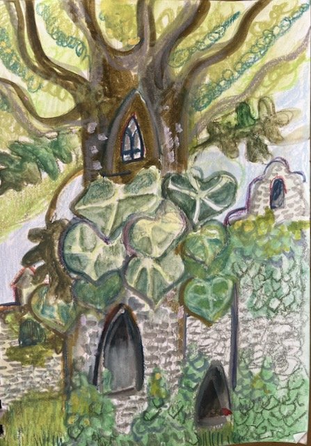
I sketched a lot of fallen down trees (tree falls?) but the drawing I’ve ended up developing so far was of a tree covered in a vine.
2. Artist Inspiration: Hundertwasser
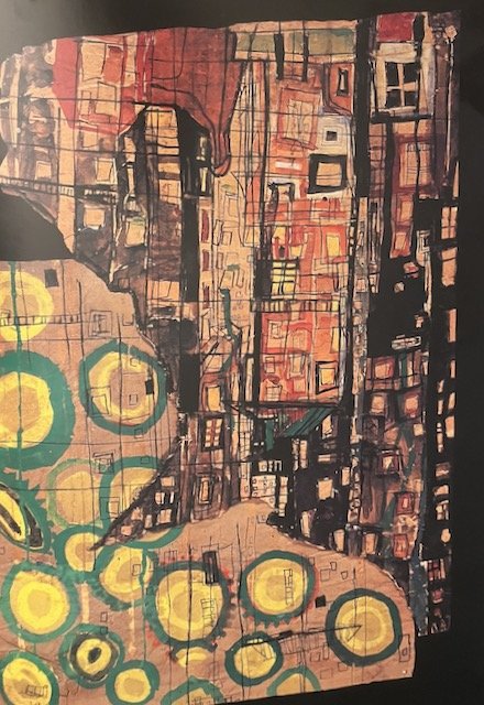
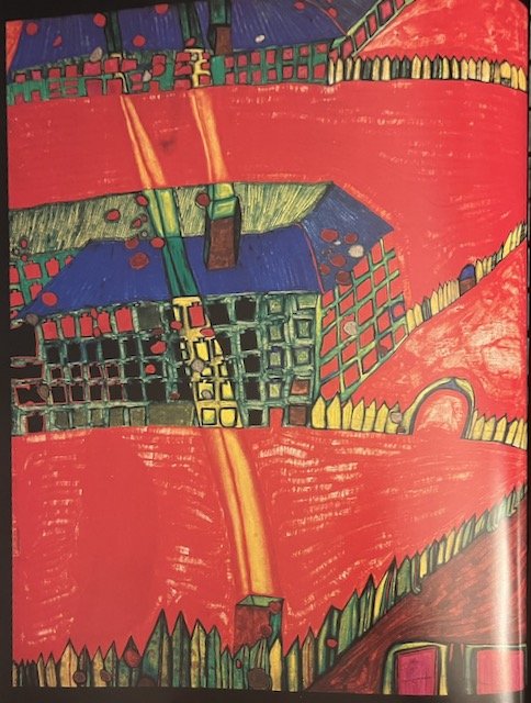
My beloved therapist told me about the Austrian artist Hundertwasser after she saw my Forsythias piece. I’d never heard of him, so I promptly relieved the library of two amazing books on the artist, one by Harry Rand, and the other by Weiland Schmied.
As is unfortunately so often the case, while I was very taken by his work, I was kind of appalled by his behavior. While he is certainly not the worst in comparison to other male artists of his time, that’s a low bar. In fairness, he struck me as more annoying than awful. BUT I do still really love this work:
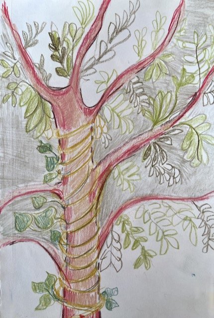
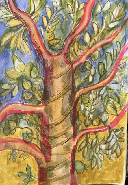
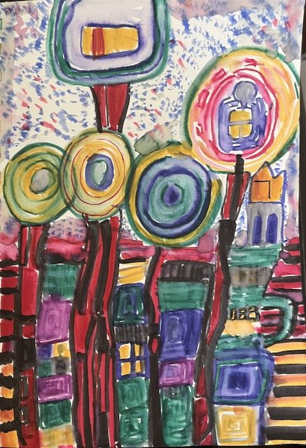
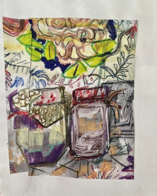
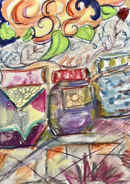
When I love an artist, I copy a couple of their works into my sketchbook. It’s the best way to really do a close observation — it’s called a “study” for a reason! These aren’t meant to be faithful reproductions — that’s not important to me at all. But I learned a lot from doing these two:
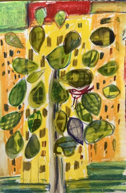
I see some of Hundertwasser’s influence in this drawing I did a couple of weeks later.
3. More Inspiration: Poetry
The bulk of my attention this month was on doing drawings and paintings inspired by poems and literature. This came from a development of an exercise taught by Sarah Dyer in her excellent Patreon. I don’t want to describe the process too much — go subscribe if you’re intrigued — but it involves making a a simple folded book, in order to find unusual compositions. (Of course because I like making books and know a few other folded book forms, I took the general idea and went off in my own direction.)
I got a little obsessed by this process, and ended up with about 10 compositions I wanted to develop further. I’m not sharing too many of these right now — more next month.
Here’s one example of a composition I really like that I derived from this process, inspired by a gorgeous poem by Craig Santos Perez.
Here’s another example — the “book” page is on the left, and the first drawing I did is on the right. (This was inspired by the poem by Sandra Simonds.)
4. Ongoing/Misc.
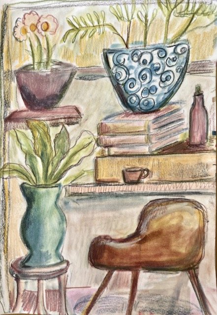
I continue to draw in coffee houses and cafes, my natural habitat. I found an idea from Sandi Hester very liberating — she draws elements from an observed scene and just place them where she feels like it/makes her own composition. My journalism background makes that feel very naughty, but of course that’s totally fine! And it makes drawing in coffee houses much more interesting.
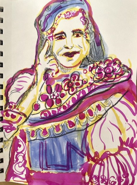
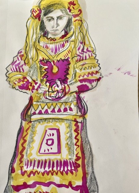
I made my first excursion to the main branch of the Pittsburgh public library. It’s lovely, and grand in proportion to the size of this city. (It’s not fair to compare it to the NYPL’s main branch, so I won’t, except to say this: it’s smaller, of course, but definitely more user friendly.) I found a book about embroidery techniques from around the world and of course went wild drawing from it. A couple of Greek brides above.
Programming Note: Every creative person I know struggles with how much to make public, what to keep private. I always feel like I struggle more than most with this, but I probably don’t.
I DO want to share what happens in my studio, but there’s also a need to keep things contained for a while, so I can let them develop without positioning them for public consumption. Even though I have a fairly low profile, and even though I’m sharing mostly visual work and not words, the simple act of sharing and describing fixes it into place, in a way I’ve found intensely vulnerable and sometimes creatively destructive.
My answer, until now, has been basically just not to share anything until it was so far in the rearview that I had no real feelings about it anymore. I realize, however, that this does my art and my art career no favors.
At the end of June, I decided to do an experiment — I went over all that I did in my studio, made notes, took photos. My idea was that I would share it when the time is right. Does it really matter whether I’m sharing a studio update from the month that just finished, or a month or two previous to that? I don’t think so.
So while I just completed my private July studio review, this month I’m reporting on, on August 1st, is actually what happened in June. If this feels good to me, I’ll keep it going.
Also: the photos aren’t perfectly edited and there may be typos. What can I tell you? I’m a human with only so much time in the day. :)
